| Entrance | Mainstreet | Wiki | Register |
|
# of watchers: 8
|
Fans: 0
| D20: 8 |
| Wiki-page rating |  Stumble! Stumble! |
| Informative: | 0 |
| Artistic: | 0 |
| Funny-rating: | 0 |
| Friendly: | 0 |

 *
* 
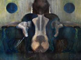 *
* 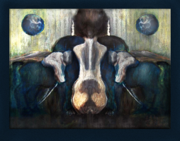 *
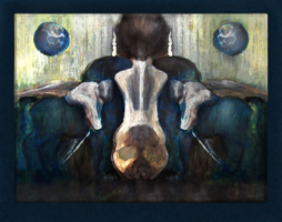
* 
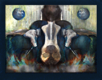
2007-03-07 [Remos Page]:  (ok then) run to the back of the room lol
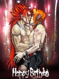
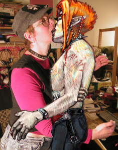
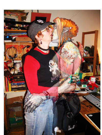
2007-03-07 [Lord Dog]: what I meant was see how you have his face elongated on the top one? Just widen it so that the ears almost touch the sides
2007-03-07 [moira hawthorne]: I think I am going to... ... basically instead of stretching the whole thing and warping it to an elongted shape .. Im gonna break the elements up... and size them individually to fix as best as possible... but .. the reason why I didnt want to do that was the varigated b/g.. so I'll have to clear it out and make it again
2007-04-24 [dfreetolove]: I love it
2007-04-24 [moira hawthorne]: which... it???
2008-02-13 [moira hawthorne]: new art up ~ any one want to pick this apart?
2008-02-14 [Cia_mar]: i like the leaves... but i think that the large one on teh left needs downsizing... it competes too much with the fay for drawing your eye
2008-02-14 [moira hawthorne]: cant be smaller... its in front of her...
Im trying to make it like the one on the right... but its closer so sortta abit more detail... like all the leaves fade as them get more distance
2008-02-14 [moira hawthorne]: need to make it less 3D... looks too thick now...
2008-02-14 [moira hawthorne]: ok I think it is finished now... anyone have any other opinion?
2008-02-14 [Lord Dog]: Was thinking you could make it curled or something to show more movement but nt really necessary
2008-02-14 [moira hawthorne]: ooooooh that would of been good... I was using the photoshop leaf brush as a template... they dont curl... damn now it looks all flat to me!... but not enough time to start drawing leaves from scratch!
2008-02-27 [Lord Dog]: Looks better both the leg and the arm...
2008-02-27 [moira hawthorne]: i need to go to bed now... but other than curling the leaves... which im thinking of doing now that I have time... is there anything else?
2009-01-20 [Rebulous]: Yes, enter it in the Dark Arts competition. Most definitely. I think your intuition is right on the flames - it might be too much.
2009-01-20 [moira hawthorne]: wait wait... im just about to upload them now... tell me what you think when you see them
2009-01-20 [jaraden]: i SURE as hell likes!!!!!!!!!
this painting looks WICKED!!!!!!!!
gapes in awe!!!!
and get's wood.. har har, just kidding!
2009-01-20 [Rebulous]: OK, I stand corrected. The flames do look good. Looks almost like something out of a DOOM video game. Definitely dark.
2009-01-20 [moira hawthorne]: ok I think its a go than... thx for all your approval... Ill put this one in the competition wiki ...wish me luck! there some awesome pieces in there already... [dayah]'s and [Pnelma Tirian]'s both are awesome!
2009-01-20 [Rebulous]: Yeah, maybe, but so is yours!
| Show these comments on your site |
|
Elftown - Wiki, forums, community and friendship.
|